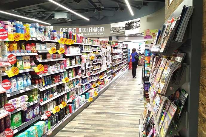
Visual merchandising is an essential element for turning your retail shop into an elaborate showcase that entices customers, invites them to get to know your products and then take them home.
Visual merchandising is about how you lay the store out as well as how you present goods attractively on your store shelving, in a way that makes sense to your customers. Many retailers have got this down to an art. At the same time, others struggle, believing naively that “if we build it they will come”. Yes, they may buy what they came into your store looking for, but if you’re not creating opportunities for upselling, you’re missing out big time.
Here is the CAEM advice for maximising retail opportunities and boosting sales with your visual merchandising.
1. Choose your shop shelving wisely
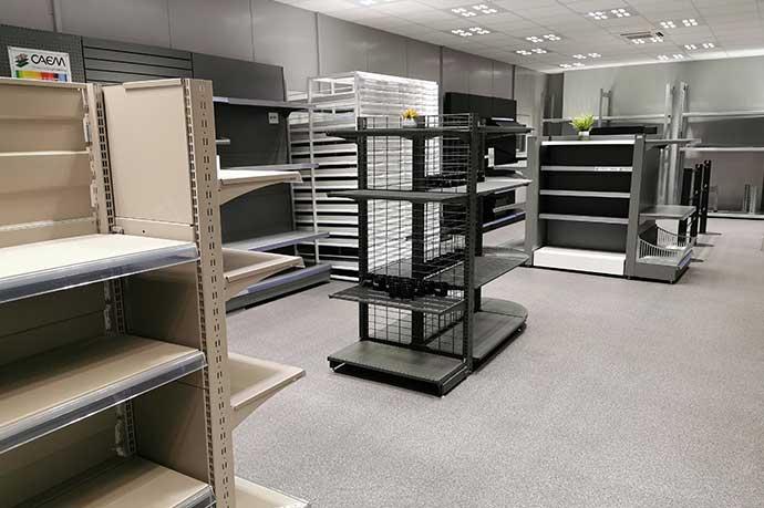
 It all starts with the foundations. Shelving may not seem like the most exciting element of the display. However, flexible store shelving that allows for additional accessories, comfortable browsing and regular reshuffles is key to successful visual merchandising throughout the store.
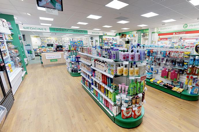
Shop Gondolas make the best use of the space available by allowing you to display goods on both sides of the same shop shelving unit, saving on floor space. Gondola ends provide the infrastructure for attractive end displays that catch the eye.
If you change your promotional items on a monthly basis, lightweight shop shelving is a must.
2. Incorporate shelf lighting
 Another important element of your retail display is the focal point. This protagonist is your high-ticket promotional item that you want customers to see as soon as they walk into your retail shop. The right lighting draws the customer’s eye towards the hotspots within the display. Including well-lit hotspots can significantly increase conversions by over 200%. Ensure your lighting doesn’t take away from your profit margins; choose LED lighting optimised for safety and keep costs down.
3. Choose a colour theme
 Adopting a colour palette sends out a subliminal message to our brains that there is a link between the items we are looking at. Create a contrast between the background and the showcase items to make them really stand out. For example, if your walls are white, consider using black shop shelving with a red accent. The beauty of a well-curated display elicits an emotional response that makes people want to buy, even if they are not sure why.
4. Use signage
 Well incorporated signage educates the customer about the products on display. Feature some of the benefits in bullet points to appeal to their logical brain and help them justify their initial emotional response. Testimonials are something we’ve come to expect on websites and social media, so why not include them in your physical store displays too? This provides the social proof the customer may be needing to finally push them over the hurdle of indecision.
5. Create retail display using related products
 It’s no use building a display from a random selection of items from different product categories unless they go together. For example, if you’re selling picnic baskets, consider including a blanket and a flask too. That way, you increase the possibility of the customer purchasing more than one item.
6. Display newest items first
If you’ve got a brand-new range of goods in-store, don’t hide them at the back of your retail store. Put them pride of place at the front so they are the first items a customer sees when they walk in. This will also ensure that you keep your displays fresh and novel so repeat customers don’t get used to seeing the same products time and again. If you’re prioritising newer ranges, you will automatically switch the retail display up once new goods arrive anyway.
These are just a few of the many ideas that exist for successful visual merchandising. If you’re looking to revamp your store and you’re interested in exploring the shop shelving and retail display products available, why not take a closer look at our shelving and lighting systems? Or better still, get in touch today.
